10 Crucial Lessons From History’s Greatest Graphic Designers
Simplify, visualize, know your user: the lessons of these design pioneers, from El Lissitzky to Paula Scher, are as relevant as ever.
Many people know the names of influential architects, artists, and fashion designers; far fewer know the names of graphic designers. It’s strange to me, since graphic designers create so much of our everyday world. And it’s not only civilians with a general interest in design who lack that knowledge. I have also encountered many design professionals and students who don’t know Herbert Bayer from Herbert Matter. I wanted to change that.
I wrote Graphic Icons: Visionaries Who Shaped Modern Graphic Design to highlight pioneers of graphic design, from El Lissitzky to Paula Scher. In the course of researching the book, I came to realize that each of these figures offers key lessons for today’s designers. Early 20th-century German designer Lucian Bernhard favored a flat minimalism that echoes the pared-down design popular in many contemporary user interfaces. Swiss designer Joseph Müller-Brockmann embraced and mastered the use of the grid, an important part of modern web design. Here’s a look at how can we take inspiration from these figures–not by copying their style, but by creating something new that is informed by their pioneering spirits.
Lucian Bernhard: Simplify
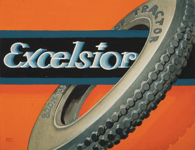
Lucian Bernhard was in his early twenties in 1905 when he entered his design in an advertising poster contest sponsored by Priester matches. Although Art Nouveau was popular at the time, with its complex ornaments and floral embellishments, Bernhard took a different creative direction, painting a simple scene showing a smoking cigar in an ashtray with matches. A friend saw the artwork and thought it advertised cigars. So Bernhard reduced all unnecessary detail until all that remained was a pair of red matches. He then painted the brand name. There was no slogan, nothing to distract from the visual of the product and its name.
Not only did Bernhard’s design win the contest, it launched a new, straightforward style of advertising that he continued for clients such as Excelsior Tires and Adler Typewriters. German companies in particular embraced this new flat minimalism, which they called Sachplakat (object poster, which led to the broader Plakatstil, or poster style–advertisers felt that Art Nouveau’s intricate decoration could obscure or compete with their product.
El Lissitzky: Communicate without words
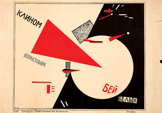
In 1921, Russian designer El Lissitzky was among a group of artists who broke away from Kasimir Malevich’s Suprematists–who believed art need not serve any function beyond its intrinsic, spiritual value–to focus on practical design to aid Russia’s new communist state. These were the Constructivists.
Lissitzky, whose work had several distinguishing characteristics–layouts structured on a grid, limited color palettes, tense diagonals, sans serif type, and repetition of pure geometric forms, believed that art and design could communicate in a nation where much of the population was illiterate. He aimed to establish a visual language using shape and color instead of letterforms; in his famous political poster Beat the Whites with the Red Wedge, geometric shapes tell the story of the revolutionaries shattering the establishment.
Ladislav Sutnar: Understand your user
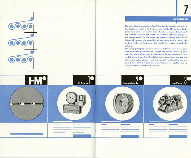
Czech-born Ladislav Sutnar collaborated with writer Knud Lönberg-Holm to improve Sweet’s Catalog Service, which compiled the catalogs of different manufacturers in the construction industry. Recognizing that people look for products in different ways, they developed a system that cross-referenced each item by company, trade, and product name. Sutnar clarified the vast amount of information, using colors, shapes, charts, and graphic symbols to guide the reader. He established hierarchy by emphasizing type–changing scale and weight, reversing out of color, and using italics and parentheses–which made skimming, reading, and remembering easier. (He also established the standard protocol of putting phone number area codes in parentheses.) Sutnar was moving beyond the single page and embracing the double-page spread, creating designs that weren’t just visually interesting, but also helpful. The way he steered readers through complex information sounds much like what we now call information design or information architecture, which has been further developed by Edward Tufte and Richard Saul Wurman, as well as by digital and web designers everywhere.
Alvin Lustig: Suggest, don’t explain
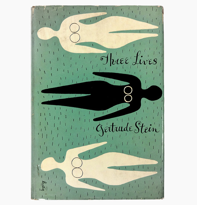
Although Alvin Lustig designed magazines, interiors, packaging, fabrics, hotels, mall signage, the opening credits of the cartoon Mr. Magoo–even a helicopter–he is best known for his book covers. New Directions publisher James Laughlin had been packaging reprints of modern literary titles in a pretty traditional format, and they weren’t selling. Lustig came on board and gave the books new life with bright colors and abstract visuals that echoed the art of Joan Miró and Paul Klee. Rather than showing an image that explicitly represented the story, Lustig read the work and created symbolic visuals that interpreted the book’s overall meaning. The approach worked: stores began displaying the books prominently, and sales tripled. While Laughlin hoped readers weren’t buying the books solely for their covers, he was grateful that the design exposed more people to quality writing.
Josef Müller-Brockmann: Use the grid
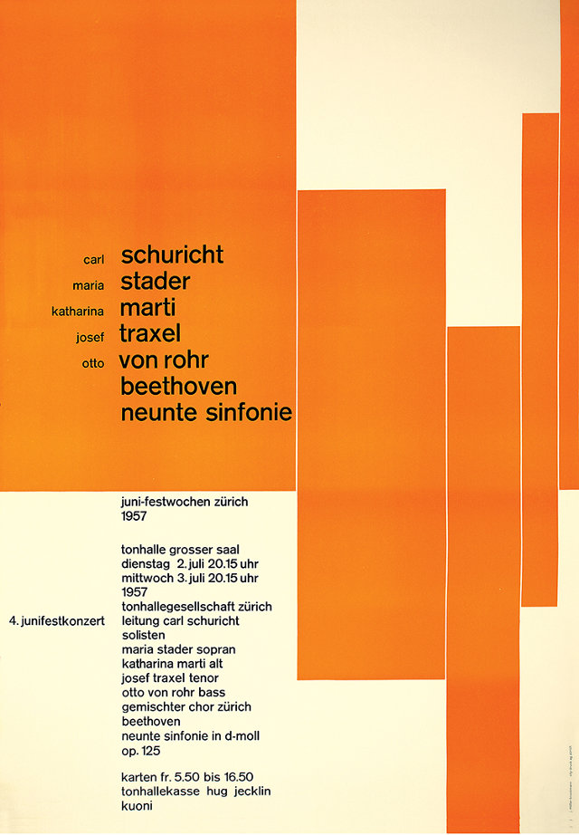
The work and writing of Max Bill, an architect and designer who studied at the Bauhaus, influenced Josef Müller-Brockmann and led him away from his illustrative beginnings. Bill developed Theo van Doesburg’s idea of a universal visual language by using a modular grid–the underlying framework of columns and margins that guides the placement of text and images in a layout. It provides order, consistency, and flexibility, and helps to establish hierarchy. It continues to be an important tool today, especially in web design.
This grid-based approach to graphic design became the foundation of the International Typographic Style, or Swiss Style, and Müller-Brockmann was a key figure in this influential movement. He stripped extraneous decoration from his design; every element in his layout had a purpose. Over time, his work grew increasingly abstract. For example, he designed a series of concert posters for Zurich’s Tonhalle. There were no music notes or instruments. Geometric shapes and lines were placed on the grid, but were varied in position and scale to suggest movement and rhythm. The result was abstract, yet very musical.
Ivan Chermayeff and Tom Geismar: Don’t limit yourself to one style

In 1960, Chermayeff and Geismar proposed a radical idea: a corporate logo, for Chase Manhattan Bank, that was not based on letterforms or a recognizable image. Their design was simple–four wedges rotated around a square to form an octagon–but it was met with resistance, because at that time no major American corporation had an abstract logo. And that’s precisely why it worked; it stood out from the competition and became an identifying symbol inextricably associated with Chase. Soon, other corporations followed suit with abstract logos of their own.
But Chermayeff and Geismar haven’t limited themselves to a particular style. For them, design is solving problems, and they pursue the best solution, regardless of form. They’ve designed more than 100 corporate identities, for clients such as NBC, PBS, Screen Gems, Barneys New York, Boston’s MBTA, and Pan Am. They also create digital media and exhibitions, at venues like the well-known Ellis Island Immigration Museum and the John F. Kennedy Library. Now called Chermayeff & Geismar & Haviv, their strength is in their ideas, and they continue solving problems.
Muriel Cooper: Embrace technology
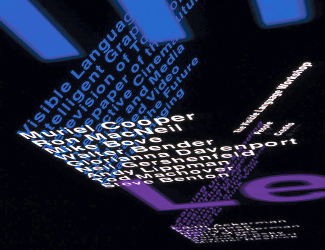
Muriel Cooper had two design careers: first as a print designer and second as a groundbreaking digital designer. As art director for MIT Press, she designed classic books, such as Hans Wingler’s Bauhaus, and the first edition of Learning from Las Vegas (authors Robert Venturi, Denise Scott Brown and Steven Izenour hated what she did, but many graphic designers loved it).
Cooper took her first computer class at MIT in 1967, and it bewildered her. However, she could see the computer’s potential in the creative process, and soon began the second phase of her career: applying her design skills to computer screens. With Ron MacNeil, Cooper cofounded the research group Visible Language Workshop in 1975, which later became part of MIT’s Media Lab. She presented the group’s research at the influential TED5 (Technology, Entertainment, Design) conference in 1994. For the first time, computer graphics were shown in three transparent dimensions, which moved, changed sizes, and shifted focus, instead of the standard Windows interface of opaque panels stacked like cards. She made a big impact: Even Microsoft founder Bill Gates was interested in her work. Unfortunately, she died soon after of a heart attack, but her legacy in interactive design continues.
Stephen Doyle: Don’t dumb down the design to reach a larger market
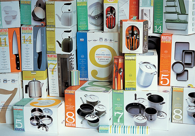
After working at Esquire, Rolling Stone, and Tibor Kalman’s influential M&Co., Stephen Doyle partnered with Tom Kluepfel and William Drenttel in 1985 to launch Drenttel Doyle Partners, a hybrid design and advertising agency. Drenttel left in 1997, and the studio carried on as Doyle Partners.
Doyle’s packaging for Martha Stewart’s line of home goods sold at mass-market retailer Kmart remains among his most high-profile work. And for good reason: Doyle used clean typography, bright colors, and beautiful photography to create a unified and instantly identifiable brand that included thousands of products. The packaging–and the products themselves–proved that high-quality design could appeal to everyday shoppers seeking everyday goods.
Paula Scher: Use type as image
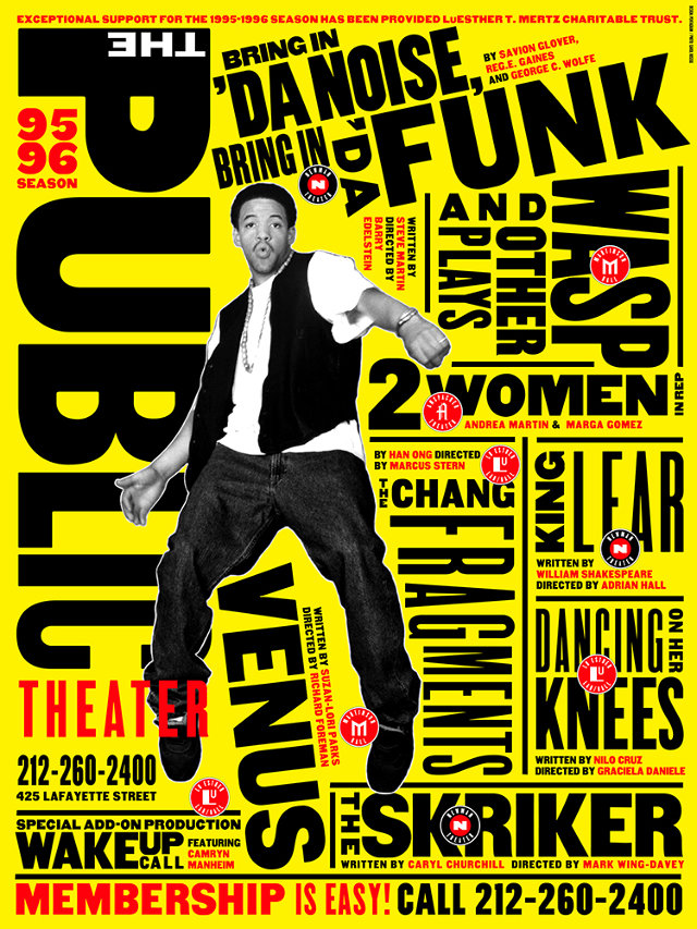
As a design student, Pentagram’s Paula Scher couldn’t get the hang of working with type, of formally positioning words and letters in a layout. Then her teacher, Stanislas Zagorski, suggested that she think of type in a more conceptual way, using it as the main image in her work to communicate visually as well as verbally.
In 1994, Scher took on a defining project: a new identity for New York City’s Public Theater (formerly known as Shakespeare in the Park). Director George Wolfe wanted a visual identity that looked nothing like Shakespeare, and Scher designed exactly that: a big, bold typographic language that was loud and urban and distinctive. Her street posters for the show Bring in Da Noise, Bring in Da Funk pushed this in-your-face style even further, with brash type that actually looked noisy. Scher’s design became so popular that it changed theater advertising, as more groups tried to capture the youthful vigor of her work for the Public.
John Maeda: Get a design education

John Maeda was a computer science grad student at MIT on his way to becoming a user interface designer. Then he read Thoughts on Design, by Paul Rand–an experience that shifted the course of Maeda’s career. He took a humbling message from Rand’s book: Understanding the computer did not necessarily make one a good designer. He decided to study graphic design, where he added traditional design skills and concepts to his knowledge of computers.
Maeda then returned to MIT to teach, and founded the Aesthetics and Computation Group at the Media Lab. It was there that Maeda explored the area where design and technology meet. For Maeda, the computer is a tool and a medium. He created early digital experiences like The Reactive Square, in which shapes responded to sound, and Time Paint, a time-based program of flying colors. In his quest to educate, Maeda writes books, emphasizes creative thinking, and was the president at Rhode Island School of Design. His goal? Not to make the world more high-tech, but to make it more humane.
This article was adapted from Graphic Icons: Visionaries Who Shaped Modern Graphic Design by John Clifford. Copyright © 2014. Used with permission of Pearson Education, Inc. and Peachpit Press
Comments
Powered by Facebook Comments
