1
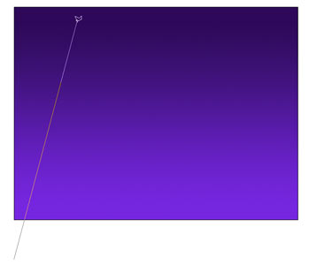
 Begin with a new document. You can either use a photo, or create one yourself. In this case it’s just a blue gradient.
2
 Choose the polygon lasso tool. Hold down your mouse on the lasso tool to reveal the polygon one.
3
 This tool doesn’t work with dragging. To work the Polygon Lasso, you click at the origin. As you move your cursor, a line will follow it (Kind of like gum on the sole of your shoe.). Click again to create a line.
Tip: To quit dragging gum press the esc key.
4
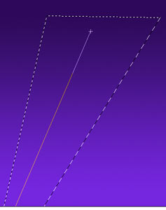
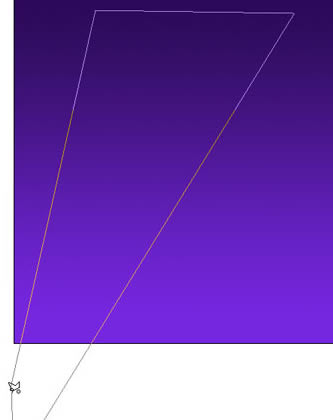 Keep clicking in the shape of a triangle (sort of). To complete the selection, hover your mouse over the origin (The first place you clicked). You will see little circle. This circle means that you will complete the selection if you click on the start point. Do it!
5
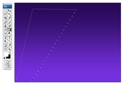 As soon as you click on the start point, you will notice the marching ants selection (and the gum isn’t stuck to your shoe anymore).
Now, we are ready to fill with color. Press the D key to reset the Foreground/Background colors.
Press the x key to swap the color. White is now the foreground color.
(You could just choose white as the foreground color and avoid all the shortcuts, but it’s good to learn them right?)
6
 Choose the Gradient tool. Go to the options bar at the top and choose 2 things.
1. Click the gradient to open the options, select the foreground to transparent option as shown.
2. Make sure that you choose the linear gradient option.
Finally, make sure that the transparent option is turned on in the options bar at the top and reverse is off.
7
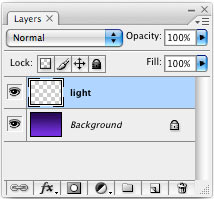 Wait! One more thing. Create a new layer and select it, so we don’t add pixels to the background.
8
 Click at the bottom of the selection. Drag the gradient along the selection, but not past the selection.
9
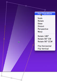 Release the mouse and you now have a gradient. Turn off the selection by pressing ctrl/cmd+D or clicking away with the selection tool.
To change the shape, press Ctrl/Cmd+T for the free transform tool. Right click for additional options such as perspective. Change the shape to suit your needs by dragging any of the little squares (adjustment handles).
10
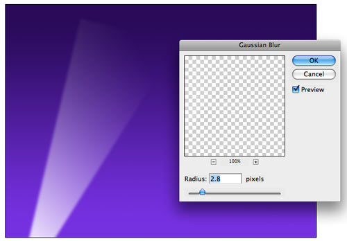 We now have a spotlight, but it lacks realism because the beams have hard edges. To soften the beams, choose Filter>Blur>Gaussian Blur. Enter a setting o suit your needs and click OK.
11
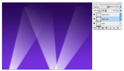 To add more beams, Duplicate the layers and use free transform to change the angles.
12
 Here I added the word Hollywood, so that you can see the transparency effects.
13
 Try adding the effect to different backgrounds. In this picture I made some stars and added the spotlight. This shows the gradients off really well. You can drop the opacity if you want to lesson the effect.
wrap up
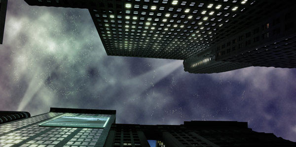
Don’t forget, you don’t have to use this effect for vertical spotlights. Here is a futuristic cityscape I have been working on. Notice the effect in the sky.
I hope you enjoyed this tutorial. See you at the CAFE

 Make sure you have your image on its own layer with no background.


 As stated before, the actual process of defining these textures will be covered in another article, but let’s take a look at some effects we can create using this process. I’m starting with simple white type on a black background.
 Ok, once this is loaded into the textures drop down, all you no do is select Texture Overlay from the Layers Palette and select the pattern you would like to use to overlay your design.
 for more info.
 Hmmm… there must be more we can do to this type though. What about applying more layer styles to the textured image?


 Just play around with it to get a feel for it. Here’s what I came up with in about a minute:
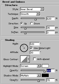 Ok, let’s bevel this puppy. Go to your layer styles, and use settings close to these:
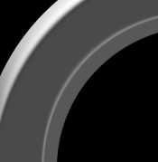
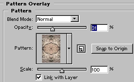 Ok, back to the circle. First, duplicate the circle layer, make the top layer invisible and select the lower layer. After you have downloaded the pattern set, load it into the layer styles and apply the pattern shown in the example to this layer. Here are my settings:
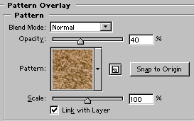 Leave that layer alone for a minute. Select the top layer, and appy another pattern to it, lowering the opacity to about 40%.
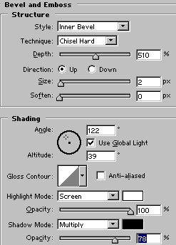
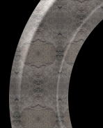
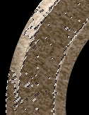 Create a layer beneath this one, select the top layer and again merge down. Using either the magic wand or color selection option, we want to select only portions of this layer.
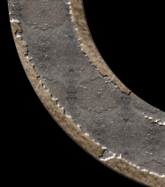 Here’s the result:
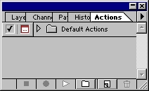 With Photoshop open, hit F9 to bring the Actions Palette to the front. For this tutorial I’m using Photoshop 5, but the process is the same for 6.0 also. After you hit F9, you should see this palette:
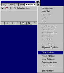 Ok. Now from the menu we can start recording, or we can also press the New Set Icon from the bottom of the palette. All actions must be in a set before you can record. You may then select ‘New Action’ from the menu, or just hit the New Action Icon from the bottom of the palette. Once you hit record you’re in business… every step you make in Photoshop will now become part of the Action provided it is a command that can be recorded. Stick with the commands you can control from the drop down menus and you are in good shape, as not all tools can be recorded. This will save you a few of those pesky error messages when you try rerunning the action later.
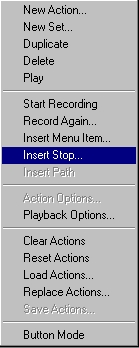 The first thing I do is set up a new image for my text actions. Generally I start with something 9 inches wide, 5 inches high, 72 dpi, RGB, white background.
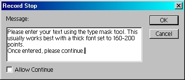
 To save a whole lot of time and space, I’m not going to go through the entire process for this effect, as it is simply recording the steps I took to go from this:
 recording, select the Set that your action is in, name it and save it from the Actions Menu. You can now distribute your action for all the world to play with, as I’ve done here. If you would like this effect for your very own, I’m sending it with this article. Or if you cannot find the link,
 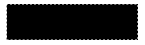 Create a new layer, Make a shape, select it and fill with foreground color. Alt/Option delete.
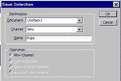 Select>save selection name the new channel “shape”
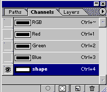

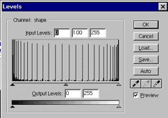 Open the levels box: Cmd/Ctrl +L
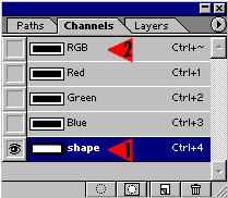 Ctrl/Cmd click on the channels thumbnail (1) to turn on the selection. Click on the RGB thumbnail to select all channels (2)
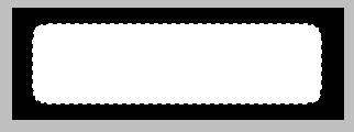
 Go back to the layers palette. Create new layer (layer 2)
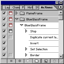 EDIT MODE
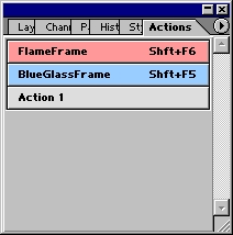 Button Mode
 To close, I’ll give you a quick example of what actions can do, using an action I created. With a click of the play button,
 Bye for now!
 This is the technique that will wrap your art around objects and (seemingly) magically make it hug every contour
 Click on the Channels palette and click on each channel until you find the one with the most contrast (dark to light). In this case it is the Red channel.
 We need to make a new document out of the channel.
 You will now have a new document. This will become our displacement map. Apply a 0.7 Gaussian blur (Filter>blur>Gaussian blur) to lower the sharp detail a bit. This will make for a smoother image in the end.
 Save the document as a .psd, Any name will work, just remember it and the location. I put mine on the desktop.
 On our original document, click on the “RGB” to restore the default channel display.
 Open the layers palette and add your artwork or text on a new layer. This is the content that you want to warp. Make sure you have everything you want to warp on one layer. If you have text, rasterize it now. (Right click on the layer palette next to the name and choose “rasterize layer” from the pop up menu.
 Now lets apply the displacement map…
 Use the settings shown here when the Displace palette opens.
 You will now see a browser asking you to choose a displacement map.
 You will now see your artwork distort to hug the texture of the rock.
 Choose Overlay mode to add some realistic blending.
 Here is the result on the blending mode.
 Here is exactly the same image but with a variation.