0 (Intro)
I originally wrote this tutorial for Photoshop CS3, in the years since then, Photoshop has gotten a couple of big upgrades in the HDR area, and we are now at Photoshop CS6. I have also learned a great deal more about the subject, so I decided it was time for an update.
What is HDR and why do we need it?
I n this tutorial we will take a look at HDR photography. HDRI (High Dynamic Range Imaging) was originally used in 3D and is now in full force in photography. Basically it’s the process of taking multiple exposures and merging them together into a single 32 bit image. Let me explain:

|
A camera is capable of capturing a limited amount of tones in a single photo (we call this dynamic Range, the range of tones that can hold detail between pure black and pure white). Typically we sacrifice elements in a photo when we set the cameras exposure. We meter for the most important part of the scene. For example let’s look at the series of images I shot at the Bradburry building in Los Angeles. The center image is a typical exposure, showing an average metering to produce the most detail possible. Notice that the detail outside the door is lost because it’s too bright. Also the detail on the stair rail is lost because it’s too dark. When you are at the location, you are able to see all these detail with your eye, this is because the human eye can see a larger range of tones than the camera can capture on the sensor or film in a single photograph.

The solution is to take more than one photograph and bracket the photos. Shoot a normal exposure (center image), then under-expose (left) to capture the highlights outside the windows and over-expose (right) to capture shadow detail. Finally, merge these photos together to produce a single image with a larger range of tones that can now show all the details in the shadows and highlights.
This tutorial will show you how to complete this process with the minimum fuss.
Tips for photographing HDR
First we need to capture our source images with our camera. Technically you will need to shoot a minimum of 2 photos with different exposure settings to create a HDR. I personally get good results from 3 shots. I like to over expose and under expose by 2 stops each. I know this is a bigger bracket than some people are comfortable with, but for the type of HDR images I like to create (cityscapes), this works great. If you’re shooting people, you may want to reduce this to single stops.
Sometimes you need to capture more than 3 exposures. It really depends on how much contrast is in your scene. For the example of the Bradburry building, I captured a series of Photographs inside a dark building in Los Angeles with a sunny day outside a glass window. I needed 7 photots with 2 stops apart in order to capture the entire dynamic range of that scene. You might be able to capture a lower contrast enviroment such as a foggy day in a single frame. But once again, for the majority of HDR photography 3 shots are usually perfect. I set the camera for Auto Exposure Bracket and 2 stops + and -. Make sure that you only change the shutter speed. If you change the aperture, the depth of field will also change, producing unwanted blurring in your final composite. Use a tripod if you can, otherwise support yourself on a wall or solid object to reduce movement between frames.
Note: For real HDR, you shouldn’t use a single raw image and exposure it several times as some people suggest. This is unessesary, as you can use the Shadow and Highlight recovery and adjustment brush in Camera Raw or Lightroom to bring out the same amount of detail in the photo. Also there has been misinformation circulating, using the term “Single Image HDR”. This is known as pseudo-HDR. You can’t get HDR (HIGH Dynamic Range) from a single SDR (STANDARD dynamic Range) photo. It’s like “single speaker stereo”, the digital informaition just isn’t there. You can apply a tone-mapped effect to a single image for a grungy feel. It’s psudo HDR, but not to be confused with true HDR.
For more details see the full 4.5 hour video HDR and Photoshop
Join the PhotoshopCAFE list
Adobe Photoshop tutorials, tips, tricks, discounts and announcements from PhotoshopCAFE. It’s fast and free! Get the CS4 Superguide for free. No spam.
|
HDR in Photoshop tutorial
1
Start with 3 images. One normal exposure, the second underexposed and the third overexposed. In this case I used 2 stop bracketing. As I shoot a lot of city scapes I can get away with 2 stops, because I’m mainly shooting flat surfaces and banding and posterization isn’t such a problem. If your shooting rounded and curved surfaces you will want to lower your bracketing to get smoother gradients, although there is a lot of overlap already in the tones as a decent DSLR camera can capture around 11 Stops of exposure.
I set the bracketing on my camera to 2 stops. Then I set the shooting mode to burst. When I hold the shutter down, 3 photos will be captured. I shoot in the RAW format for the widest possible dynamic range. You can still create HDR if your camera doesn’t support RAW, but bear in mind a jpg is only an 8-bit file.
Make sure you shoot in Aperture Priority or in Manual. You want to bracket the exposure time, not the Aperture. If you change the aperture, the depth of field won’t be consistent and you’ll get blurring. Also avoid any moving subjects in the photo or you’ll get “ghosting” where something is only in one frame and will appear very strange in the final. If you look at the three image that I used here, the middle image has a lot of detail. However, the details in the shadows are lost in the boats and the city lights are too bright and lose detail information. The left image is under exposed to pick up the details in the highlights such as the buildings in the background. The right hand photo is over exposed by 2 stops to pick up the detail in the shadows, such as the hulls of the boats and water reflections.

2
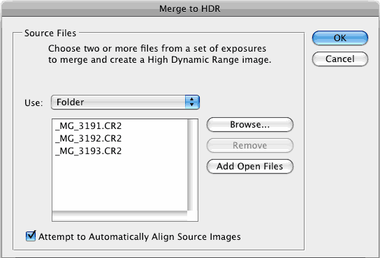
Time to merge the photos together into a single 32 bit image.
Choose File>Automate >Merge to HDR Pro. This works on Photoshop CS2 – CS6 (CS2 Doesn’t have auto align and it’s called “Merge to HDR on versions older than CS5). Choose either images or folder. I organize each set of photos in its own folder so I used the folder option. Select your photos to merge. Turn on Auto Align in Photoshop CS3+. Click OK. (Photoshop uses Auto-align technology that even allows you to create HDR without the use of a tripod!)
3
Your images will now be merged into a single photo. You can turn off individual photos by un checking their boxes on the left filmstrip. If you get some blurring caused by camera shake in the longest exposure, you may want to turn off that photo. If there is ghosting because of movement, click the box: Remove Ghosts.

4
The merged result is a floating-point 32 bit image. Change the mode to 32 bit. You can view the available tones by sliding the White Point slider. Note, this slider doesn’t change the image, it is there for you to examine the range of tones, because a monitor is incapable of displaying all the tonal detail in a 32-bit file all at once.
5
You could do your tonemapping right now if you like, but I like to save a 32bit negative. Click OK to merge the photos into a 32 bit image. Now is a good time to save your file. Save as a psd, tif or open EXR.
If you are working with 3D and are wanting HDRI for IBL lighting, enviroments etc, save as open EXR as Maya and other 3D packages recognize this format. (you are finished here, photographers read on).
6
In order to use the photos, you’ll need to convert them to 16 or 8 bit images. When we convert them we will create what I call interpretations of the photo. The reason I say this is because we have unlimited ways we can make the photo look. While we have this huge dynamic range available in 32 bit, we will no longer have those options after conversion. Always work from the saved 32 bit version, and then convert and save versions (personal interpretations). Avoid overwriting the 32 bit image, it’s our master and we may want to go back to it many times.
Choose Image>Mode>16 bit (or 8 bit). Now we get to play with some fun options. You’re now at the tone mapping part of the process. This is were all the creativity can ooze.
(If you want to make the adjustments without converting, choose view>32 Bit Preview Options. You can use several of Photoshop’s tools in the Image>Adjustments menu. The most important of these is the Exposure control)
You’ll see an HDR Toning Dialog box (HDR Conversion for versions before CS5). Exposure and Gamma is the default option. Best way to approach this? Set the gamma first, then adjust the exposure to suit. If you want an image with lots of contrast, lower the gamma. For less contrast raise the gamma. Finally, adjust the exposure to get the desired brightness. If you want more control, read on… otherwise press OK to convert.

7
Change the Method to Local Adaption. (There are 4 available methods, but these are the only 2 with user input).
With local Adaption, you get some advanced Tone Mapping sliders and you can adjust the curves. The use of curves is optional as they allow you to fine tune the other settings. Set these like you would normally work in curves, but don’t be afraid to clip the histogram a little. You can clip because you’re working with a larger dynamic range than you’re used to. Bring out the detail in the image, but don’t forget to put some shadow in there or it will look washed out and fake.
Edge Glow
Once your happy with the curve, adjust the radius and strength sliders to make sure there are no halos in the photo. (Badly converted HDR images have a glow around the areas of contrast.) The radius controls the mask blur while the strength decides how strong to apply the effect.
Tone and Detail
Gamma: This is where you control the contrast. Extremes are washed out or super punchy.
Exposure: Controls the overall brightness.
Detail:This sharpens or softens the appearance.
Advanced
Shadow: Opens up details in darkest parts of the photograph.
Highlight: Recovers detail in the brightest areas of the photograph.
Vibrance: This makes the photo more colorful without over saturating areas that are already colorful. (It’s smart).
Saturation: Increases or decreases the overall amount of color. Be careful not to over saturate the colors as a rule. (Of course all rules can be broken on occasion).
Click ok to convert.
8
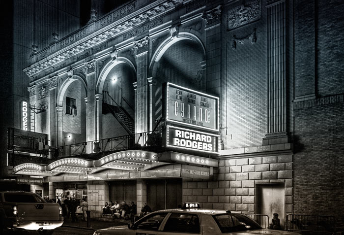
Here we have a merged image from HDR. Photoshop is great for producing very realistic HDR images.

9
If your desiring a more surreal result there are different plug-ins that you can use. My favorite is Photomatix pro from HDRsoft. You can just get the tone mapping plug in for Photoshop which works great. Use the coupon code photoshopcafe to save 15%.(code is also good for Photomatix pro)
Using photomatix tone mapping plugin allows you to get highly detailed textures in your photographs. You merge in Photoshop as shown in this tutorial. Then choose Filter>Photomatix to apply tone mapping. Convert and save as normal.

10
This image shows an image after tone mapping using Photomatix pro.

11
Here you can see comparisons between a single image, subtle Photoshop HDR and a radical Photomatix effect Whatever result your after, hopefully this tutorial has helped demystify the HDR process. 
12
HDR and Lightroom and Camera RAW
A new development in the latest release of Lightroom. 4.2 is the ability to work with 32 bit images. This is wonderful because you can use the adjustment brush to fine tune areas of the photograph while working in a 32 bit enviroment. The image below shows the result of working with the adjustment brush in Lightroom. Notice how I was able to craft the image. (The same is possible with ACR). Read on for instructions…
In order to work with a 32 bit file in Lighroom, you must do the following.
1. Merge to HDR as mentioned earlier in this tutorial.
2. Save as 32 bit file, be careful to save as a TIF, it will only work with a Tiff.
3. Import back into Lightroom, or open in Adobe Camera Raw.
4. Use the adjustments as you would normally, but enjoy a lot more control and larger range of tones than before.
Here are a few more examples of my HDR photography.
Here is another HDR shot of mine. This is a night scene converted to grayscale.


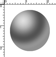
 Make sure you have your image on its own layer with no background.


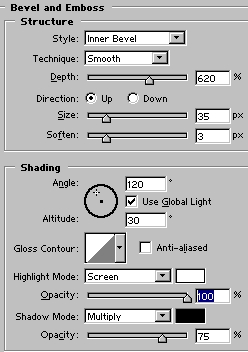 Ok, let’s bevel this puppy. Go to your layer styles, and use settings close to these:
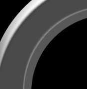
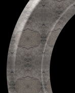
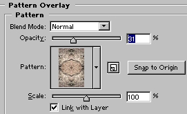 Ok, back to the circle. First, duplicate the circle layer, make the top layer invisible and select the lower layer. After you have downloaded the pattern set, load it into the layer styles and apply the pattern shown in the example to this layer. Here are my settings:
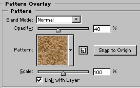 Leave that layer alone for a minute. Select the top layer, and appy another pattern to it, lowering the opacity to about 40%.
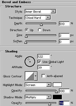
 Create a layer beneath this one, select the top layer and again merge down. Using either the magic wand or color selection option, we want to select only portions of this layer.
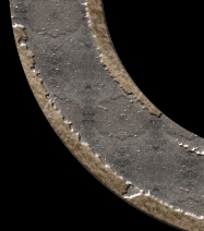 Here’s the result:
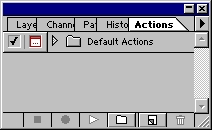 With Photoshop open, hit F9 to bring the Actions Palette to the front. For this tutorial I’m using Photoshop 5, but the process is the same for 6.0 also. After you hit F9, you should see this palette:
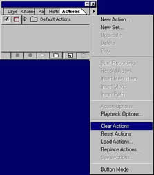 Ok. Now from the menu we can start recording, or we can also press the New Set Icon from the bottom of the palette. All actions must be in a set before you can record. You may then select ‘New Action’ from the menu, or just hit the New Action Icon from the bottom of the palette. Once you hit record you’re in business… every step you make in Photoshop will now become part of the Action provided it is a command that can be recorded. Stick with the commands you can control from the drop down menus and you are in good shape, as not all tools can be recorded. This will save you a few of those pesky error messages when you try rerunning the action later.
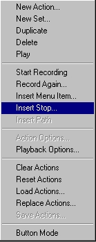 The first thing I do is set up a new image for my text actions. Generally I start with something 9 inches wide, 5 inches high, 72 dpi, RGB, white background.
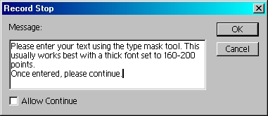
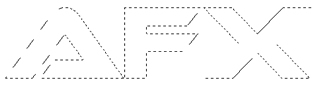 To save a whole lot of time and space, I’m not going to go through the entire process for this effect, as it is simply recording the steps I took to go from this:
 recording, select the Set that your action is in, name it and save it from the Actions Menu. You can now distribute your action for all the world to play with, as I’ve done here. If you would like this effect for your very own, I’m sending it with this article. Or if you cannot find the link,
 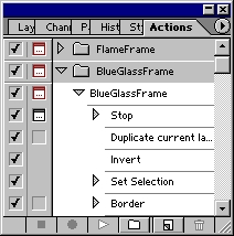 EDIT MODE
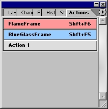 Button Mode
 To close, I’ll give you a quick example of what actions can do, using an action I created. With a click of the play button,
 Bye for now!
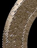
 This is the technique that will wrap your art around objects and (seemingly) magically make it hug every contour
 Click on the Channels palette and click on each channel until you find the one with the most contrast (dark to light). In this case it is the Red channel.
 We need to make a new document out of the channel.
 You will now have a new document. This will become our displacement map. Apply a 0.7 Gaussian blur (Filter>blur>Gaussian blur) to lower the sharp detail a bit. This will make for a smoother image in the end.
 Save the document as a .psd, Any name will work, just remember it and the location. I put mine on the desktop.
 On our original document, click on the “RGB” to restore the default channel display.
 Open the layers palette and add your artwork or text on a new layer. This is the content that you want to warp. Make sure you have everything you want to warp on one layer. If you have text, rasterize it now. (Right click on the layer palette next to the name and choose “rasterize layer” from the pop up menu.
 Now lets apply the displacement map…
 Use the settings shown here when the Displace palette opens.
 You will now see a browser asking you to choose a displacement map.
 You will now see your artwork distort to hug the texture of the rock.
 Choose Overlay mode to add some realistic blending.
 Here is the result on the blending mode.
 Here is exactly the same image but with a variation.


 Time to fine tune the mask. Choose a black brush and make the edge hard. Paint over all the areas that belong in the object to mask out. Use a larger brush for large areas and a smaller brush for finer detail such as around the feathers. Use a white paint color to paint out the areas that should be removed.
 Sometimes it can be hard to guess which part of the image belongs in the foreground and a peek at the original image is needed. Click on eye icon to the left of RGB at the top of the Channels palette (Fig 5). The original photo is now visible and the mask appears as a reddish color. Click the eye icon to go back to the mask view. The mask can also be hidden by toggling the eye (visibility icon). Keep going until you have a clean mask.
 Hold Cmd(Ctrl PC) and click on the Alpha 1 thumbnail. You will now see an active selection. Click on RGB to see the color image. Open the layers palette. Select the working layer and press the Delete key (Backspace on Windows). The masked area of the backround will now be removed to reveal a nice clean masking effect. At this point In am only worried about removing the pink background on the left.
